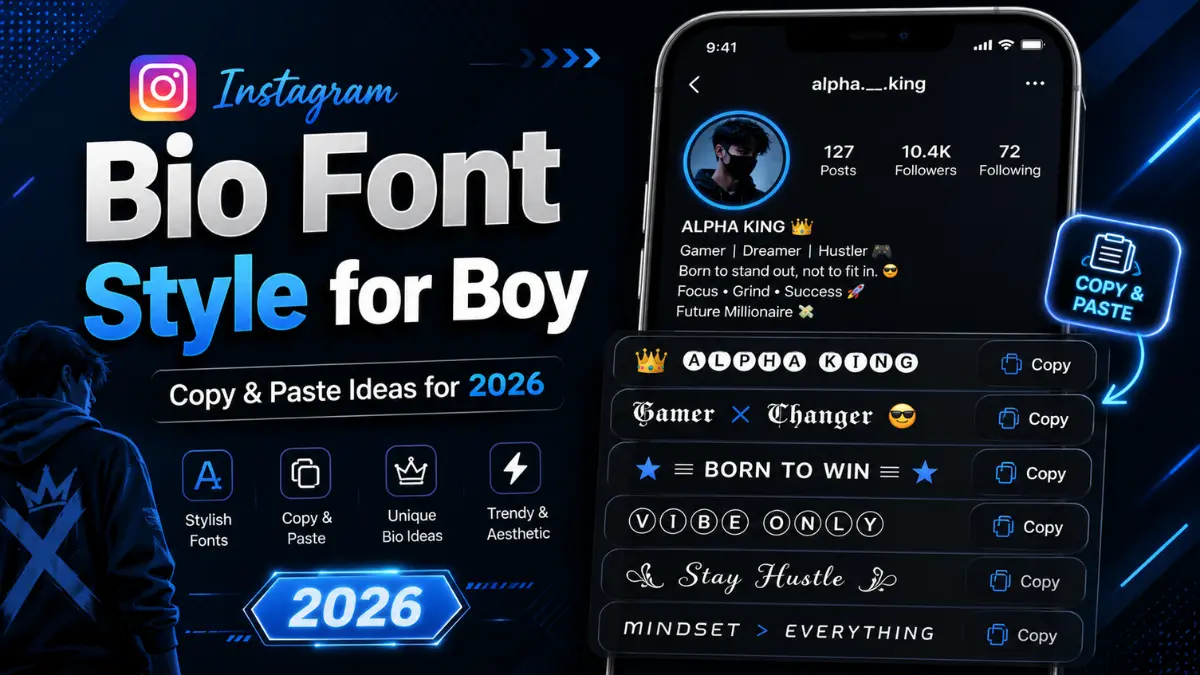
Instagram Bio Font Style for Boy (Copy & Paste) | 2026
Introduction
Your Instagram bio is the first thing anyone sees when they land on your profile. You have 150 characters and a few seconds to make an impression. One of the most powerful — and underused — ways to stand out is choosing the right Instagram bio font style for boy profiles.
Most guys use plain text. That instantly makes a styled bio rare, eye-catching, and memorable.
This guide goes further than the usual font-list articles. You will learn which font styles work for which personalities, how Unicode fonts actually work on Instagram, what affects your character count, and how to build a bio that looks sharp on every device. All fonts below are copy-paste ready.
What Are Instagram Bio Font Styles? (And How Do They Actually Work?)
Instagram does not let you change fonts natively. So how do these stylish letters appear?
The answer is Unicode — the international text-encoding standard. Unicode contains thousands of characters beyond the standard A–Z alphabet, including mathematical script letters, double-struck characters, Fraktur (Gothic) letters, and more. These look like different fonts but are technically just different characters.
When you paste them into your Instagram bio, Instagram displays them as-is — no app required, no special permission needed.
Key things to know:
- These characters work on iOS, Android, and desktop alike.
- They copy across apps — WhatsApp, Twitter/X, TikTok, YouTube, and more.
- They are permanent in your bio as long as you save them.
- Some characters may appear as small boxes on very old devices, but this is increasingly rare in 2024.
What competitors don’t tell you: Unicode “fancy” characters are not fonts — they are individual letters mapped to different Unicode code points. This means spell-check won’t flag them, and screen readers may read them differently (or skip them). Keep this in mind if accessibility matters to your audience.
The Instagram Bio Character Limit — And How Fonts Affect It
Instagram bios have a 150-character limit. Here is what most sites forget to mention:
Each Unicode “styled” character still counts as one character, just like a normal letter. So switching from plain text to a fancy font does not shrink your available space.
However, some emoji and special symbols use two character slots (because of how Unicode encodes them). If your bio suddenly gets cut off after you add a symbol, that is why.
Pro tip: Type your bio in plain text first, count your characters, then swap to a styled font. This way you know exactly how much space you have before styling.
Font Style Categories for Boys — Explained
Different font styles carry different vibes. Here is a breakdown of the most popular categories and what personality each one projects.
1. Cursive / Script Fonts — Classic & Sophisticated
Script fonts feel smooth, personal, and slightly luxurious. They work well for boys who want to look polished without being try-hard.
Examples:
| Plain Text | Cursive Style |
|---|---|
| attitude | 𝒶𝓉𝓉𝒾𝓉𝓊𝒹𝑒 |
| king | 𝓴𝓲𝓷𝓰 |
| bold | 𝒷𝑜𝓁𝒹 |
| warrior | 𝓌𝒶𝓇𝓇𝒾𝑜𝓇 |
| savage | 𝓈𝒶𝓋𝒶𝑔𝑒 |
Best for: Lifestyle, travel, fashion, and creative niches.
2. Bold / Double-Struck Fonts — Strong & Confident
These thick, heavy characters project confidence and command attention. Perfect for attitude bios and boys who want a powerful presence.
Examples:
| Plain Text | Bold Style |
|---|---|
| king | 𝕜𝕚𝕟𝕘 |
| boss | 𝕓𝕠𝕤𝕤 |
| alpha | 𝕒𝕝𝕡𝕙𝕒 |
| hustle | 𝕙𝕦𝕤𝕥𝕝𝕖 |
| legend | 𝕝𝕖𝕘𝕖𝕟𝕕 |
Best for: Gym, fitness, entrepreneurship, and motivational profiles.
3. Gothic / Fraktur Fonts — Dark, Edgy & Unique
Gothic (Fraktur) fonts have a medieval, intense look. They are rare on Instagram, which makes profiles using them stand out sharply in any feed.
Examples:
| Plain Text | Gothic Style |
|---|---|
| king | 𝔨𝔦𝔫𝔤 |
| dark | 𝔡𝔞𝔯𝔨 |
| wild | 𝔴𝔦𝔩𝔡 |
| beast | 𝔟𝔢𝔞𝔰𝔱 |
| rebel | 𝔯𝔢𝔟𝔢𝔩 |
Best for: Gaming, metal/rock music fans, streetwear, and alternative aesthetics.
4. Italic Fonts — Cool & Effortless
Italic-styled text has a lean, dynamic feel — like the words are moving forward. It looks clean without being too heavy.
Examples:
| Plain Text | Italic Style |
|---|---|
| chill | 𝘤𝘩𝘪𝘭𝘭 |
| vibes | 𝘷𝘪𝘣𝘦𝘴 |
| solo | 𝘴𝘰𝘭𝘰 |
| dream | 𝘥𝘳𝘦𝘢𝘮 |
| focus | 𝘧𝘰𝘤𝘶𝘴 |
Best for: Minimalist, aesthetic, and personal branding profiles.
5. Small Caps — Clean & Professional
Small caps give your bio a typographic, editorial feel — like a well-designed magazine byline.
Examples:
| Plain Text | Small Caps |
|---|---|
| creative | ᴄʀᴇᴀᴛɪᴠᴇ |
| builder | ʙᴜɪʟᴅᴇʀ |
| thinker | ᴛʜɪɴᴋᴇʀ |
| writer | ᴡʀɪᴛᴇʀ |
| leader | ʟᴇᴀᴅᴇʀ |
Best for: Professionals, students, writers, and anyone going for a clean, serious tone.
6. Strikethrough / Underline Text — Edgy & Decorative
Adding strikethrough or underline to text creates a visual hook that makes viewers pause and look twice.
Examples:
- S̶a̶v̶a̶g̶e̶ M̶o̶d̶e̶
- B̲o̲s̲s̲ L̲i̲f̲e̲
- N̶o̶ ̶R̶u̶l̶e̶s̶
Best for: Attitude-heavy bios, ironic or humorous profiles.
7. Bubble / Circle Text — Fun & Playful
Bubble letters are rounded, bold, and immediately catch the eye. They feel energetic and approachable.
Examples:
| Plain Text | Bubble Style |
|---|---|
| fun | ⓕⓤⓝ |
| free | ⓕⓡⓔⓔ |
| live | ⓛⓘⓥⓔ |
Best for: Casual, funny, and social profiles.
Ready-to-Use Instagram Bio Font Styles for Boys
Here are complete bio ideas in styled fonts — organized by attitude. Copy any of these directly.
Attitude Bios
𝐈 𝐝𝐨𝐧'𝐭 𝐟𝐨𝐥𝐥𝐨𝐰 𝐫𝐮𝐥𝐞𝐬, 𝐈 𝐦𝐚𝐤𝐞 𝐭𝐡𝐞𝐦.𝕭𝖔𝖗𝖓 𝖙𝖔 𝖘𝖙𝖆𝖓𝖉 𝖔𝖚𝖙.𝑺𝒊𝒍𝒆𝒏𝒄𝒆 𝒊𝒔 𝒎𝒚 𝒃𝒆𝒔𝒕 𝒓𝒆𝒑𝒍𝒚.
ᴍʏ ʟɪꜰᴇ, ᴍʏ ʀᴜʟᴇꜱ, ᴍʏ ᴡᴀʏ.𝒩𝑜𝓉 𝑒𝓋𝑒𝓇𝓎𝑜𝓃𝑒'𝓈 𝒸𝓊𝓅 𝑜𝒻 𝓉𝑒𝒶 — 𝐼'𝓂 𝒶 𝓈𝒾𝓅 𝑜𝒻 𝓌𝒽𝒾𝓈𝓀𝑒𝓎.
VIP / Stylish Bios
𝕶𝖎𝖓𝖌 𝖎𝖓 𝖒𝖆𝖐𝖎𝖓𝖌 👑𝒟𝓇𝑒𝓈𝓈𝑒𝒹 𝒻𝑜𝓇 𝓈𝓊𝒸𝒸𝑒𝓈𝓈.𝐋𝐮𝐱𝐮𝐫𝐲 𝐢𝐬 𝐚 𝐬𝐭𝐚𝐭𝐞 𝐨𝐟 𝐦𝐢𝐧𝐝.
ʜɪɢʜ ᴄʟᴀss ɴᴏᴛ ʜɪɢʜ ᴍᴀɪɴᴛᴇɴᴀɴᴄᴇ.𝑩𝒐𝒔𝒔 𝒎𝒊𝒏𝒅𝒔𝒆𝒕, 𝒄𝒉𝒂𝒎𝒑𝒊𝒐𝒏 𝒉𝒆𝒂𝒓𝒕.
Savage / Cool Bios
𝔜𝔬𝔲 𝔠𝔞𝔫'𝔱 𝔥𝔞𝔫𝔡𝔩𝔢 𝔪𝔢.𝓦𝓲𝓵𝓭 𝓫𝔂 𝓷𝓪𝓽𝓾𝓻𝓮, 𝓫𝓸𝓻𝓷 𝓽𝓱𝓲𝓼 𝔀𝓪𝔂.𝙎𝙖𝙫𝙖𝙜𝙚 𝙢𝙤𝙙𝙚: 𝙤𝙣.
Motivational / Hustle Bios
𝔾𝕣𝕚𝕟𝕕 𝕟𝕠𝕨, 𝕤𝕙𝕚𝕟𝕖 𝕝𝕒𝕥𝕖𝕣.𝑺𝒖𝒄𝒄𝒆𝒔𝒔 𝒊𝒔 𝒏𝒐𝒕 𝒂 𝒅𝒆𝒔𝒕𝒊𝒏𝒂𝒕𝒊𝒐𝒏, 𝒊𝒕'𝒔 𝒂 𝒋𝒐𝒖𝒓𝒏𝒆𝒚.𝗛𝘂𝘀𝘁𝗹𝗲 𝗶𝗻 𝘀𝗶𝗹𝗲𝗻𝗰𝗲. 𝗟𝗲𝘁 𝘀𝘂𝗰𝗰𝗲𝘀𝘀 𝗺𝗮𝗸𝗲 𝘁𝗵𝗲 𝗻𝗼𝗶𝘀𝗲.
Funny / Witty Bios
𝒞𝑜𝓃𝒻𝓊𝓈𝑒𝒹 𝒷𝓊𝓉 𝒸𝑜𝓃𝒻𝒾𝒹𝑒𝓃𝓉.ⓝⓞⓣ ⓐ ⓟⓛⓐⓨⓔⓡ, ⓙⓤⓢⓣ ⓐ ⓖⓐⓜⓔ.𝙈𝙮 𝙗𝙚𝙙 𝙞𝙨 𝙖 𝙩𝙞𝙢𝙚 𝙢𝙖𝙘𝙝𝙞𝙣𝙚. 𝙄 𝙜𝙤 𝙗𝙖𝙘𝙠 𝙩𝙤 𝙞𝙩 𝙚𝙫𝙚𝙧𝙮 𝙣𝙞𝙜𝙝𝙩.
Gym / Fitness Bios
𝕭𝖊𝖆𝖘𝖙 𝖒𝖔𝖉𝖊: 𝖔𝖓.𝗦𝘄𝗲𝗮𝘁 𝗻𝗼𝘄. 𝗦𝗵𝗶𝗻𝗲 𝗹𝗮𝘁𝗲𝗿.𝐋𝐢𝐟𝐭. 𝐄𝐚𝐭. 𝐒𝐥𝐞𝐞𝐩. 𝐑𝐞𝐩𝐞𝐚𝐭.
Gamer Bios
𝔾𝕒𝕞𝕖 𝕠𝕟. 𝕎𝕠𝕣𝕝𝕕 𝕠𝕗𝕗.𝑰 𝒅𝒐𝒏'𝒕 𝒑𝒂𝒖𝒔𝒆 𝒎𝒚 𝒈𝒂𝒎𝒆 𝒇𝒐𝒓 𝒚𝒐𝒖.𝙻𝙸𝙵𝙴 𝙸𝚂 𝙰 𝙶𝙰𝙼𝙴. 𝙸 𝙿𝙻𝙰𝚈 𝚃𝙾 𝚆𝙸𝙽.
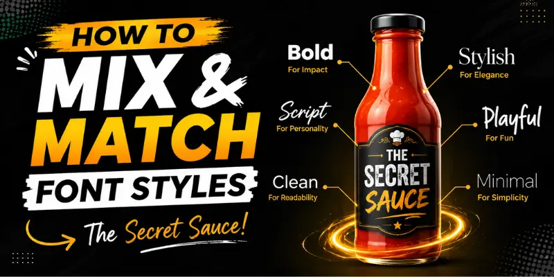
How to Mix and Match Font Styles (The Secret Sauce)
Most guides give you font lists and stop there. Here is what they miss: mixing fonts strategically is what makes a bio look designed rather than random.
Rule 1: Use One Dominant Font, One Accent
Pick one font style for your main message and a different one for your name or a single powerful word.
𝔎𝔦𝔫𝔤 𝔅𝔶 𝔑𝔞𝔱𝔲𝔯𝔢𝒸𝒽𝒶𝓈𝒾𝓃𝑔 𝒹𝓇𝑒𝒶𝓂𝓈, 𝓃𝑜𝓉 𝓅𝑒𝑜𝓅𝓁𝑒ʙᴜɪʟᴅɪɴɢ ᴇᴍᴘɪʀᴇs ɪɴ sɪʟᴇɴᴄᴇ
Three lines, three font styles — but it works because each line has a distinct function (name → personal motto → goal).
Rule 2: Keep Emoji Use Minimal
One or two emojis complement styled fonts. More than that, and the bio starts to feel cluttered. Let the font carry the visual weight.
Rule 3: Use Line Breaks Deliberately
Instagram bios with intentional line breaks are far easier to scan on mobile. Each line should be one idea — not a run-on sentence.
Rule 4: Don’t Style Every Word
Plain words between styled ones create contrast and make the styled text pop even more.
Does Changing Bio Font Style Affect Your Instagram Reach or Searchability?
This is something no competitor article addresses — and it matters.
The short answer: Yes, but only slightly, and it is manageable.
Here is what you need to know:
- Instagram’s search algorithm reads Unicode characters differently. If your name is written entirely in a Gothic or cursive Unicode font, Instagram’s search engine may not correctly index it as searchable text. This means fewer people can find you by typing your name in search.
- Your username is always plain text — Instagram does not allow Unicode in usernames. So your searchable identity lives in your username, not your bio.
- Bio text is not used for Instagram search discovery (as of 2024). Only your name field and username matter for search. This means you can safely style your bio without worrying about hurting your discoverability.
- However, if you style your name field (the bold line at the top of your profile), it may reduce how easily you appear in searches. Keep your name field in plain text or minimal styling if you want to be found easily.
How to Add Stylish Font to Your Instagram Bio — Step by Step
- Go to a Unicode font generator (like igfonts.io, fontb.com, or piliapp.com).
- Type your bio text in the input field.
- Scroll through the generated styles and find the one you like.
- Click to copy the styled version.
- Open Instagram → Go to your profile → Tap “Edit Profile.”
- Paste the styled text into the Bio field.
- Preview on mobile before saving — some fonts look different at smaller sizes.
- Tap Done / Save.
Tip: If you are doing this on a desktop browser, use the Instagram web app at instagram.com. The process is identical.
Common Mistakes Boys Make With Instagram Bio Fonts
Avoid these to keep your bio looking sharp:
1. Using too many different font styles in one bio Mixing five different font types looks chaotic. Stick to two, maximum three.
2. Styling the username You cannot change your username font — Instagram does not allow it. Any tool claiming to do this is misleading you.
3. Forgetting mobile preview Always check how your bio looks on a phone screen. Some ornate fonts become hard to read at small sizes.
4. Over-using symbols as separators Rows of ✦ ✦ ✦ ✦ ✦ or ————— take up valuable character space and look dated. Use a simple line break instead.
5. Copying a bio that does not match your personality A savage, dark-Gothic bio on a food photography page will confuse your audience. Match the font vibe to your content niche.
Instagram Bio Font Style for Boy — By Niche
Here is something competitors never organize: font recommendations by content category.
| Your Niche | Recommended Font Style | Why It Works |
|---|---|---|
| Fitness / Gym | Bold / Double-Struck | Projects power and discipline |
| Travel | Cursive / Script | Feels adventurous and poetic |
| Gaming | Gothic / Fraktur | Matches the dark, intense gaming aesthetic |
| Fashion / Style | Italic + Small Caps | Clean, editorial, sophisticated |
| Comedy / Meme | Bubble Text | Fun, approachable, light-hearted |
| Motivation / Hustle | Bold Serif Unicode | Authoritative and inspiring |
| Music | Gothic or Bold Script | Artistic and distinct |
| Personal / Casual | Small Caps or Italic | Understated and cool |
Frequently Asked Questions
Can I use these fonts on my Instagram name (not just bio)?
Yes, you can style your display name (the bold name at the top of your profile). However, as mentioned above, styling your name may reduce your searchability. Use minimal styling or plain text for the name field if you want to appear in search results.
Do these fonts work in Instagram stories or captions?
Yes. Any Unicode text you copy can be pasted anywhere on Instagram — captions, comments, story text boxes, and DMs.
Will these fonts look the same on all phones?
Almost all modern smartphones (iOS 15+ and Android 10+) render Unicode characters correctly. Very old budget phones may show some characters as blank boxes, but this affects a tiny fraction of users in 2024.
Do I need an app to use these fonts?
No. All you need is a browser and a font generator website. No download required.
Can I use styled fonts in my Instagram username?
No. Instagram strictly enforces plain text for usernames (only letters, numbers, periods, and underscores are allowed).
Will my bio look different on desktop vs. mobile?
The font characters themselves will look identical. However, line breaks and spacing can shift slightly depending on screen width. Always preview your bio on mobile before finalizing.
Final Tips to Make Your Bio Stand Out
- Start with your identity — who you are or what you stand for, in one punchy line.
- Add one fact or detail that makes you specific (your city, your craft, your niche).
- End with a call to action — a link in bio reference, a DM invite, or a tagline.
- Revisit your bio every season — what felt fresh six months ago can start to feel stale.
- Keep it honest — the best bios are those that actually sound like the person writing them.
Conclusion
An Instagram bio styled with the right font is not about showing off — it is about making a fast, clear impression on anyone who lands on your profile. The right font style signals your vibe before anyone reads a single word.
Use this guide to pick the font style that fits your personality, mix it smartly, and write a bio that actually sounds like you. Plain text bios blend in. A well-styled bio makes people stop, look twice, and hit Follow.
Your profile. Your font. Your rules.