Gazzetta Slanted Font – Complete Guide & Free Download
If you’ve spent any time browsing editorial design, luxury branding, or high-end publishing, you’ve likely crossed paths with the Gazzetta Slanted Font – even if you didn’t know it by name. It carries a distinctive energy: confident, dynamic, and rooted in the rich tradition of Italian newspaper typography. But what exactly is this typeface, where did it come from, and how can you use it in your own work?
This guide covers everything – history, design details, best uses, download options, pairing suggestions, and insider tips that you won’t find anywhere else.
What Is the Gazzetta Slanted Font?
The Gazzetta Slanted Font is an italic-style typeface – or more precisely, a slanted variant – within the Gazzetta type family, designed by the Spanish type foundry Tipotype. The family takes direct inspiration from the bold, expressive letterforms used in classic Italian sports and news publications, particularly those associated with La Gazzetta dello Sport, Italy’s legendary pink sports newspaper.
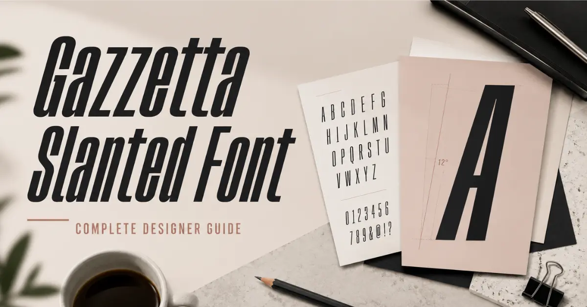
The “slanted” cut of Gazzetta gives each letterform a forward-leaning, kinetic quality. Unlike a true italic (which redraws letterforms from scratch), a slanted font applies an angular transformation to the upright design – but Tipotype’s execution goes well beyond a mechanical slant. The Gazzetta Slanted Font is carefully refined so that each character retains its optical balance and feels intentional, not just tilted.
The Story Behind the Gazzetta Font Family
Understanding the Gazzetta Slanted Font means understanding its origins. Tipotype, founded in Barcelona, built the Gazzetta family as a love letter to Italian editorial culture. The name “Gazzetta” is itself borrowed from the Italian word for gazette or newspaper, reflecting the typeface’s journalistic DNA.
Traditional Italian broadsheets – especially sports publications – were known for their dramatic, high-contrast headlines and expressive italic display text. Those publications needed type that could command attention at a glance, convey motion (fitting for sports coverage), and look stunning in large point sizes. The Gazzetta Slanted Font captures all of that and translates it for modern digital and print use.
Tipotype released the family as both a traditional desktop font and a variable font, giving designers precise control over weight and style axes – a feature that competitors and free-font aggregators rarely explain in detail.
Gazzetta Slanted Font – Key Design Features
What makes the Gazzetta Slanted Font stand out from other italic or slanted typefaces? Here’s a detailed breakdown:
High Contrast Strokes
The Gazzetta Slanted Font uses strong variation between thick and thin strokes, a hallmark of display serif typography. This contrast gives the font its editorial authority and makes it shine in large headlines.
Optical Refinement in the Slant
Rather than a purely mechanical slant angle, Tipotype’s designers adjusted individual letterforms in the Gazzetta Slanted Font to correct optical distortions. The result is a slant that feels natural and rhythmic, not digitally skewed.
Elegant Terminals and Serifs
The terminals – the ends of strokes – in the Gazzetta Slanted Font are crisp and refined. The serifs are bracketed in a way that feels classical yet contemporary, making the font work across a wide range of applications.
Multiple Weights Available
The Gazzetta family offers several weights, including:
- Regular Slanted – clean and legible, great for subheadings and body copy in large sizes
- Medium Slanted – the sweet spot between light elegance and bold impact
- Bold Slanted – commanding and dramatic; ideal for hero headlines
Variable Font Technology
One of the most underreported features is the Gazzetta Variable version. This single font file contains the full range of weights and can be adjusted with a CSS font-variation-settings property. This is transformative for web designers who want performance and flexibility.
Who Created the Gazzetta Slanted Font?
The Gazzetta Slanted Font was designed by Tipotype, a respected independent type foundry based in Barcelona, Spain. Tipotype is known for high-quality display and editorial typefaces used by brands and publishers worldwide.
What sets Tipotype apart is their attention to cultural context. When they created the Gazzetta family, they researched Italian newspaper typography extensively, studying the letterform traditions of late 19th and early 20th century Italian print. This research is visible in the Gazzetta Slanted Font: every curve and joint reflects considered, historically-aware design – not just aesthetic preference.
The official, licensed version of the Gazzetta Slanted Font is available through:
- Tipotype’s official website – for desktop, web, and app licensing
- Adobe Fonts – included with Creative Cloud subscriptions (as Gazzetta Variable)
- Fontspring – for individual or studio licensing
Gazzetta Slanted Font vs. Similar Typefaces
If you’re looking at the Gazzetta Slanted Font and wondering how it compares to alternatives, here’s an honest side-by-side overview:
| Feature | Gazzetta Slanted Font | Similar Serif Italics |
|---|---|---|
| Optical slant refinement | Yes | Often mechanical only |
| Variable font support | Yes | Varies by foundry |
| Editorial heritage | Italian newspaper-inspired | Generic |
| Multiple weights | Yes | Varies |
| Available on Adobe Fonts | Yes (as variable) | Varies |
Common alternatives mentioned alongside the Gazzetta Slanted Font include:
- Canela Italic – softer and more literary in tone
- Fraunces Italic – optical-size variable, strong personality
- Cormorant Garamond Italic – more classical, lower contrast
- Playfair Display Italic – more widely available but less distinctive
The Gazzetta Slanted Font occupies a unique space: it’s more expressive than a workhouse editorial serif but more controlled and refined than a purely decorative display italic.
Best Uses for the Gazzetta Slanted Font
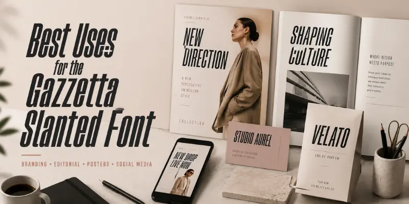
Because the Gazzetta Slanted Font carries editorial heritage and high visual drama, it excels in specific design contexts. Here’s where it performs best:
Magazine and Newspaper Headlines
This is its natural home. The Gazzetta Slanted Font was born for editorial headlines. Use it in large display sizes – 36pt and above – where the contrast and slant can do their work.
Luxury and Fashion Branding
The refined elegance of the Gazzetta Slanted Font translates beautifully to high-end branding. It suggests heritage, confidence, and taste without feeling stuffy or antiquated.
Sports Graphics and Broadcasts
The forward-leaning angle of the Gazzetta Slanted Font gives it kinetic energy – a sense of motion and urgency. Sports media, motion graphics, and broadcast chyrons are natural fits.
Book and Editorial Design
For pull quotes, chapter titles, or callouts within body text, the Gazzetta Slanted Font adds visual emphasis while maintaining typographic harmony with serif body fonts.
Packaging and Label Design
On product labels – wine, artisan goods, gourmet food – the Gazzetta Slanted Font gives an impression of craftsmanship and European tradition.
Web Headlines and Hero Sections
Using the variable version, the Gazzetta Slanted Font works beautifully on the web. Load the variable file once and adjust weight dynamically – ideal for performance-conscious design systems.
How to Download the Gazzetta Slanted Font
There are several ways to get access to the Gazzetta Slanted Font, ranging from licensed commercial use to free alternatives for personal projects.
Option 1: Adobe Fonts (Free with Creative Cloud)
If you have an Adobe Creative Cloud subscription, the Gazzetta Variable font – which includes the slanted variants – is available directly through Adobe Fonts. Activate it in Photoshop, Illustrator, InDesign, or any other CC application instantly. This is the cleanest, most license-compliant way for designers to access the font.
Option 2: Purchase from Tipotype or Fontspring
For commercial projects without a Creative Cloud subscription, purchase a license directly from Tipotype or through Fontspring. Licenses cover desktop use, web embedding, app use, and digital advertising depending on the tier you select.
Option 3: Free Download Sites (Personal Use Only)
Several aggregator sites offer the Gazzetta Slanted Font or its variants for free download, including Dafont Free, FreeFontDownload, Freefonts.io, MaisFontes, and BeFonts. Important: Carefully read the license terms before using any free download in a commercial context. Many of these are for personal or educational use only, and using them commercially without a license infringes on Tipotype’s intellectual property.
Gazzetta Slanted Font Licensing – What You Need to Know
This is a section most font review sites skip entirely, but it’s critical for professional designers.
The Gazzetta Slanted Font has distinct licensing tiers:
- Desktop License – for use in print documents, PDFs, and offline materials
- Web License – for CSS
@font-faceembedding on websites (usually priced per pageview tier) - App License – for embedding in iOS, Android, or desktop applications
- Broadcast/Digital Ads License – for video, motion graphics, and paid ad placements
When you download the Gazzetta Slanted Font from free sites, you are typically only licensed for personal, non-commercial use. Any commercial project – including client work, brand design, packaging, or web publishing – requires a proper license from Tipotype or an authorized distributor.
Buying a legitimate license is also an investment in quality: official sources provide the most complete glyph set, OpenType features, and web-optimized formats (WOFF2).
Using the Gazzetta Slanted Font in CSS and Web Design
One of the most underutilized aspects of the Gazzetta Slanted Font is its variable font capability for web use. Here’s how to implement it effectively.
Basic CSS Implementation
@font-face{font-family: 'Gazzetta';src: url('gazzetta-variable.woff2') format('woff2-variations');font-weight: 100 900;font-style: oblique 0deg 20deg;font-display: swap;}h1 {font-family: 'Gazzetta', serif;font-weight: 700;font-style: oblique 12deg;}
Variable Font Axis Control
.headline {font-family: 'Gazzetta', serif;font-variation-settings: 'wght' 650, 'slnt' -12;}
This level of control – adjusting the slant axis with 'slnt' – is unique to the variable format and gives you the full expressive range of the Gazzetta Slanted Font in a single, lightweight file.
Performance Tips
- Use
font-display: swapto prevent invisible text during font load - Preload the WOFF2 file with
<link rel="preload" as="font"> - Subset the font if you only need Latin characters
Gazzetta Slanted Font Pairing Recommendations
Great typography is rarely one font working alone. The Gazzetta Slanted Font pairs beautifully with several typeface categories:
Pair with a Neutral Sans-Serif Body Font
The drama of the Gazzetta Slanted Font in headlines is best balanced by a clean, neutral sans-serif in body text. Strong pairings include:
- GT America – modern geometric sans with warmth
- Inter – highly legible, open-source, great for long-form reading
- Neue Haas Grotesk – crisp and editorial, great complement
Pair with a Classical Serif for Body
For a fully editorial look, combine the Gazzetta Slanted Font in display sizes with a classical serif in body text:
- Adobe Garamond – refined and time-tested
- Freight Text – elegant, excellent for long-form reading
- Hoefler Text – warmth and craft, excellent for print
Pair with a Monospace for Contrast
In tech-editorial or hybrid design contexts, the Gazzetta Slanted Font can contrast beautifully with a monospace:
- IBM Plex Mono – clean and modern
- Courier Prime – journalistic heritage that echoes Gazzetta’s own
Gazzetta Slanted Font – OpenType Features
Few discussions of the Gazzetta Slanted Font get into OpenType features, but these details matter for professional typesetting:
- Ligatures – The font includes standard and discretionary ligatures (fi, fl, ff, ffl) that improve the flow of text at display sizes
- Small Caps – True drawn small caps maintain stroke weight consistency across mixed-case text
- Lining and Oldstyle Figures – Oldstyle numerals (0–9 with ascenders and descenders) are available for use in running text; lining figures for tabular data
- Swash Characters – Certain versions include decorative swash alternates, especially useful in luxury branding contexts
- Language Support – The Gazzetta Slanted Font supports a broad range of Latin-based languages including English, Italian, French, Spanish, Portuguese, German, and more
To access these features in Adobe InDesign, use the Glyphs panel or enable them through the Character panel’s OpenType submenu. In CSS, use the font-feature-settings property:
.editorial-body {font-feature-settings: "liga" 1, "onum" 1, "kern" 1;}
Real-World Examples of the Gazzetta Slanted Font in Use
The Gazzetta Slanted Font has appeared in a wide range of professional contexts:
- Magazine covers and spreads – particularly in European sports and fashion publishing
- Brand identity systems – where a heritage-informed slanted serif communicates craft and authority
- Broadcast graphics – the kinetic slant translates well to motion, making it a natural for title cards and lower-thirds
- Packaging design – artisan food and drink brands use it to suggest Italian or European craft tradition
- Event branding – its bold italic quality makes it a favorite for cultural events, film festivals, and sports tournaments
When used with intent, the Gazzetta Slanted Font doesn’t just look good – it communicates a specific set of values: motion, heritage, craft, and elegance.
Common Mistakes to Avoid with the Gazzetta Slanted Font
Even experienced designers can misuse this typeface. Here are the pitfalls to watch for:
Using It Too Small
The Gazzetta Slanted Font is designed as a display typeface. Its high contrast strokes can cause legibility issues at small sizes – especially in body text below 14pt. Keep it large.
Stacking Too Many Italics
If your design already uses a body italic, adding the Gazzetta Slanted Font as a headline italic can create visual confusion. Use it alongside upright typefaces for maximum impact.
Ignoring Leading and Tracking
At display sizes, the default spacing may feel too tight or too loose. Adjust tracking slightly – often −10 to −20 in print software – and ensure your leading (line height) gives the tall ascenders room to breathe.
Using Mechanical Slant Instead of the True Slanted Cut
Many design tools let you “fake” italic by pressing a button. Always use the actual Gazzetta Slanted Font cut – the mechanically skewed version looks amateurish by comparison.
Frequently Asked Questions
Is the Gazzetta Slanted Font free?
Some weights are available for free download on personal-use aggregator sites, but commercial use requires a license from Tipotype or an authorized retailer like Fontspring. Adobe Creative Cloud subscribers can access it through Adobe Fonts at no additional cost.
What is the difference between Gazzetta Slanted and Gazzetta Italic?
In strict typographic terms, a “slanted” (or oblique) font mechanically angles the upright forms, while a “true italic” redraws letterforms with calligraphic shapes. The Gazzetta Slanted Font is optically refined beyond a pure mechanical slant, placing it in a class of its own.
Can I use the Gazzetta Slanted Font on my website?
Yes, but you need a web font license. The variable WOFF2 format is the most efficient format for web embedding. If you use Adobe Fonts via Creative Cloud, you can embed it using the Adobe Fonts web project system.
Does the Gazzetta Slanted Font support accented characters?
Yes. The Gazzetta Slanted Font supports an extensive Latin character set, covering accented characters for Western and Central European languages.
What point size should I use for the Gazzetta Slanted Font?
For headlines: 36pt and above. For pull quotes or subheadings: 18–36pt. Avoid use below 14pt in print, and below 16px on screen.
Final Thoughts
The Gazzetta Slanted Font is more than a stylish typeface – it’s a piece of typographic history made current. Its Italian newspaper heritage, Tipotype’s careful craftsmanship, and its modern variable font implementation make it one of the most versatile and expressive display typefaces available today.
Whether you’re designing a sports magazine, a luxury brand identity, or a bold web hero section, the Gazzetta Slanted Font brings an immediacy and authority that few other typefaces can match. Its forward-leaning energy says: something is happening here – pay attention.
If you haven’t already explored it, now is the time. Start with the Adobe Fonts version for a no-cost entry point, experiment freely, and when you find the right project, invest in a proper license. The Gazzetta Slanted Font rewards careful use – and in the right hands, it’s unforgettable.